Book Design
Typesetting, layout and cover design for trade, academic and research publications.
Request Proposal →For 18 years, universities, publishers, governments and corporations have trusted Black Quill House to turn complex information into publications people actually want to read — in print and online.
Every engagement starts with your audience, not our portfolio. We design publications that communicate clearly, build trust, and hold up under real-world print and digital production.
Typesetting, layout and cover design for trade, academic and research publications.
Request Proposal →Editorial grids, mastheads and feature layouts for print and digital magazines.
Request Proposal →Financial and impact reporting designed for clarity, governance and stakeholder trust.
Request Proposal →Admissions and campus publications that reflect institutional prestige.
Request Proposal →Company profiles, capability decks and marketing collateral built to convert.
Request Proposal →Conceptual artwork and visual storytelling for publications and campaigns.
Request Proposal →Campaigns, posters and branding materials with editorial polish.
Request Proposal →Digital PDFs, flipbooks and screen-native editorial formats.
Request Proposal →Editorial-grade websites for institutions that need to be taken seriously online.
Request Proposal →Long-form interactive stories, data visualisation and immersive web narratives.
Request Proposal →Our editorial design experience spans sectors where clarity, trust and credibility are non-negotiable.
“Every great institution deserves a publication worthy of its story.”
Discuss Your ProjectThree Rewind-page features for Telangana Today, written up the way I'd walk a client through them in a review — what the brief actually was, the one idea the whole page hangs on, and what happened once it ran.
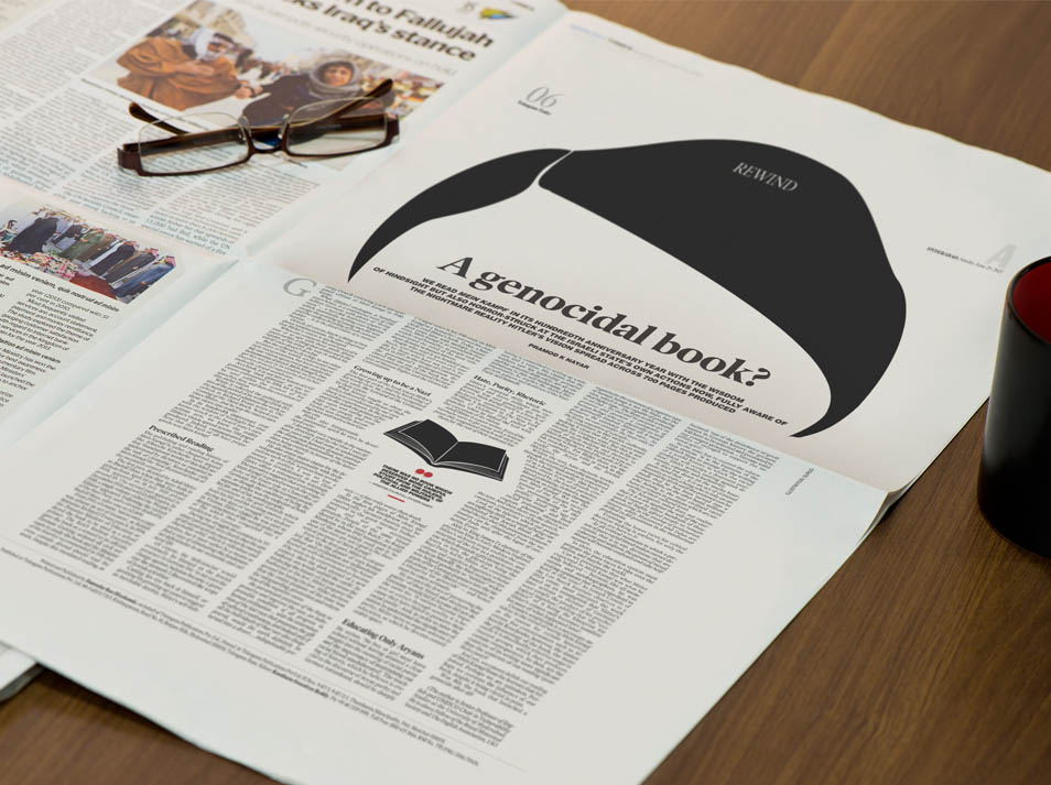 Telangana Today · Rewind, June 2025
The piece landed on the desk on the hundredth anniversary of Mein Kampf — not a history lesson so much as a warning, drawing a straight line from Hitler's 700 pages to the Israeli state's own actions in the present day. The writer, Pramod K Nayar, wasn't asking readers to relive history so much as to recognise it repeating. My brief from the desk was one line: give it a page that stops the scroll, without putting Hitler's face anywhere near it.
That was the actual problem — how do you make a reader recognise a monster without drawing him? I kept coming back to the fact that most of us could pick Hitler out from a single detail: that comb of hair. Not the eyes, not the mustache, just that one dark, oddly shaped swoop. So I drew nothing else. One solid black silhouette, blown up until it took over the top of the page, ambiguous enough that for half a second it could be a bird, an ink stain, anything — and then it isn't. The headline sits low, almost under it, so the shape does the first read and the words confirm what you already felt.
Outcome — The page went on to win a Best of Show – Bronze at the 8th International Newspaper Design Competition, Design & Illustration category, judged by NewspaperDesign.org. What I took from it: the least illustrated page I'd done all year got the loudest response — from readers and from the jury both.
Need a page that carries this much weight? Let's talk about the brief →
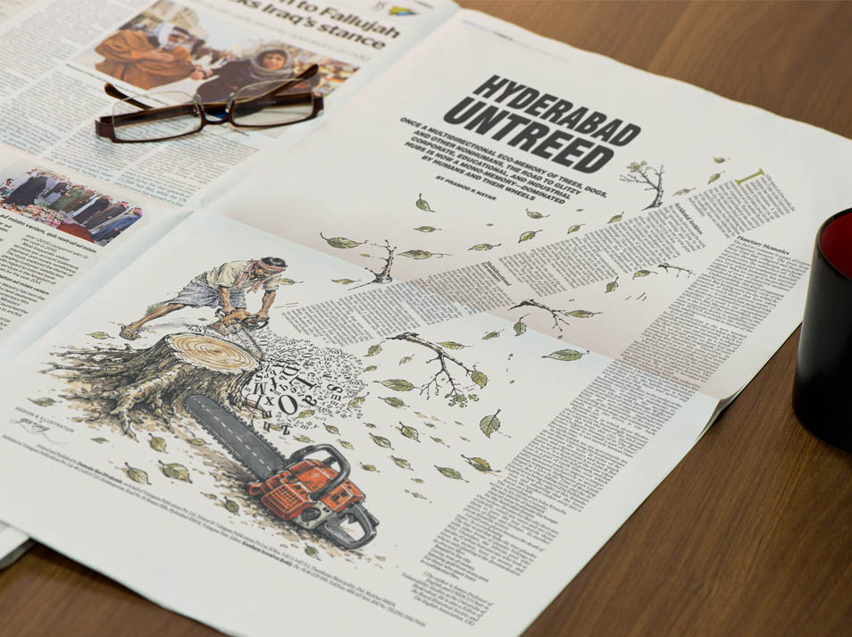 Telangana Today · Rewind Feature
Hyderabad used to hold what the writer called a multidirectional eco-memory — trees, street dogs, birds, all of it — before the city's corporate and educational sprawl flattened that into a mono-memory of humans and their wheels. That's Pramod K Nayar's argument, and on the page it reads dense, almost academic. My job was to make someone feel the loss before they'd read a single line of it.
I didn't want a sad tree in the corner of the page as decoration — I wanted the tree to be the article. So the body copy itself became the trunk: one long justified column, set on the diagonal, leaning across the page exactly the way a tree falls. A man swings a chainsaw into the stump at the bottom, and instead of wood chips, it's loose letters flying up out of the cut — the words scattering before they resettle into that leaning column above. Cut the tree, and you're literally cutting the story loose.
Outcome — It's become one of the pages the desk still pulls up as a reference brief whenever an environment story needs more than a stock photo of a stump. The diagonal "text-as-trunk" treatment has since been asked for, in one form or another, on two other Rewind features.
Working on something that needs this kind of care? Tell us about it →
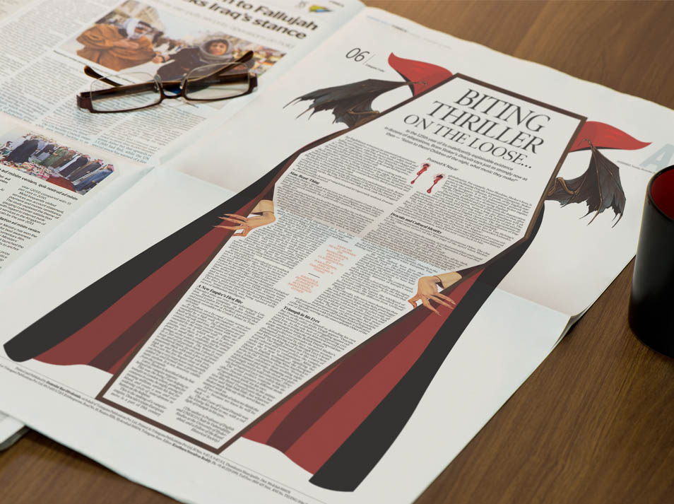 Telangana Today · Rewind Feature
A hundred and twenty-five years after Dracula was first published, the character has outlived every other literary monster through sheer volume of film, TV and stage adaptations — and that longevity, not another Halloween hook, was the actual subject of Pramod K Nayar's piece. The obvious trap here was doing a "spooky season" page — bats, fangs, a full moon — and ending up closer to a costume-shop window than a newspaper feature.
What actually makes Dracula last, I think, is that he's barely in most of his own stories — it's the cape, the threshold, the invitation, that we remember. So I drew the cape wide open across the whole page like a curtain being pulled back, bat-wing collar at the top standing in for a masthead flourish, and put nothing where the body should be. The article itself — Pramod's text — fills that empty space. The count isn't illustrated. He's implied, and the reader's imagination does the rest, which is exactly the trick the novel plays.
Outcome — It's the page colleagues still bring up whenever a horror or pop-culture anniversary feature lands on the desk — and the one I point to myself when a client asks what "restraint" looks like in a genre built on excess.
Got a feature that deserves more than a stock photo? Start a conversation →
Good editorial design doesn't decorate a story. It decides what a reader notices first — and what they carry with them once the page is turned.
— Guru Prasad Gokumakula, Founder & Art Director, Black Quill HouseA curated selection across publications, illustration, brand communication and digital experiences.
Ten volumes launching the studio's publishing imprint — collecting eighteen years of editorial illustration, design practice and institutional storytelling into books of their own.
No surprises. Every project follows the same five-stage structure, with clear approval points at every stage.
We learn your audience, constraints, and what success looks like — before proposing anything.
A transparent written proposal: deliverables, timeline and cost — no ambiguity.
Initial creative direction presented for approval before full production begins.
Full layout, illustration and typesetting, with structured revision rounds.
Print-ready files or live digital delivery, with post-delivery support included.
Editorial Design Category
Illustration Category
Professional Editorial Design Experience
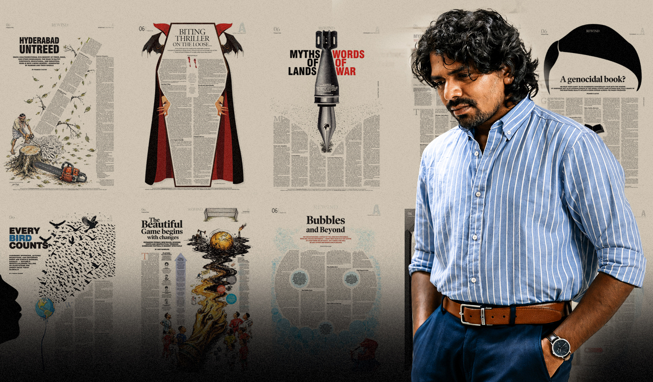
Black Quill House's Guru Prasad Gokumakula, Principal Visual Artist at Telangana Today, spoke with TK Sajeev Kumar of NewspaperDesign.org about turning complex news stories into visual narratives — creative philosophy, the role of metaphor and white space, and why strong newspaper design starts with an idea, not just an illustration.
Read the Full Interview →Guru has designed the work for several of my newspaper articles and I have always been impressed by his ability to bring written ideas to life through visual storytelling. Many of my articles deal with complex themes in international relations and geopolitics, yet he has an instinctive sense of capturing their essence — engaging and aesthetically striking for readers.
My topics aren't easy to visualize — technical, sometimes dry — and it takes real skill to turn that into something people actually want to look at. The designs did exactly that: sharp, relevant, and true to the tone of each piece. Smart, outstanding work — happy to work together again.
International recognition in both editorial design and illustration — not just one discipline.
Real track record with universities, government bodies and national media — not just startups.
NDAs signed as standard. Sensitive government and institutional briefs handled discreetly.
18 years of meeting print deadlines. We understand production schedules, not just design.
Beyond glossy photography — the layout decisions that influence admissions decisions.
Read More →Why typography and data hierarchy matter as much as the numbers themselves.
Read More →How a single conceptual image can carry an argument that text alone cannot.
Read More →Whether you're a university communicating with prospective students, a publisher producing your next title, or a government department reporting to the public — your publication has to be clear, credible, and finished on time.
Black Quill House is an international award-winning editorial design studio with 18 years of experience and 5 years specifically as an Art Director. We've designed for the University of Hyderabad, JNAFAU, Telangana Today and the Government of Telangana — bringing the same editorial rigour to every project, regardless of sector.
Start Your ProjectInternational recognition in editorial design and illustration — proof, not promises.
A real track record with universities, government bodies and national media.
This portfolio updates with every completed project — what you see is current work.
Book a discovery call. No obligation — just a conversation about what you're trying to achieve.
Tell us about your project — we'll respond within 48 hours. For confidential briefs, mention that an NDA is required and we'll send one before discussing further details.